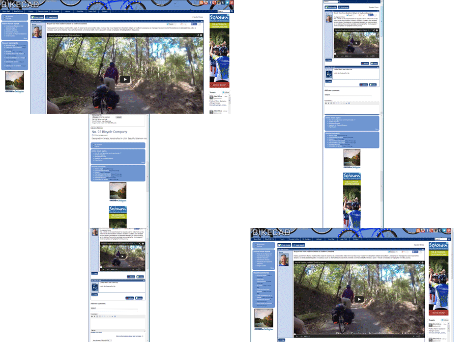
The BikeCAD.ca website now features a new responsive layout. Being responsive means the layout will adjust to suit the size and aspect ratio of your screen. If a screen is too narrow to accommodate sidebars, the content from the sidebars will be displayed below the rest of the website content. This should be particularly appreciated by smart phone users.
This magic was accomplished through the use of the Zen theme within the Drupal content management system.

Now, if I could only do something about the availability of Java on smartphones.
